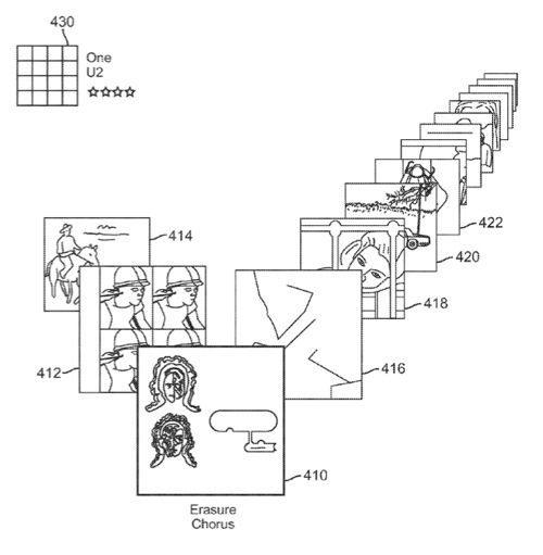
Two new Apple patents at the US Patent & Trademark Office show that Apple is considering a new “v-shaped” user interface for media playback to replace (or perhaps exist in addition to CoverFlow.
The patent obviously affects iTunes. However, it could impact the entire Mac OS X interface at some point.
Patent number 20100318908 and 20100318928 is for an user interface for media playback. According to the patent, a graphical user interface made up of icons representing individual files and collectively forming the shape of a “v” is described along with methods of using and creating the graphical user interface. The v-shaped interface is useful to display detailed information about many of the items in a list and facilitates manipulation of list order and selection of the active file in the list. The interface further permits the use of a representative icon associated with the list as a whole. Manipulation of the representative icon can cause modification or replacement of the entire playlist represented by the icon. The inventors are Michael Neuman and William Martin Bachman.
Here’s Apple’s background and summary of the invention: “Even as computer processors are becoming faster and programs more capable, space on computer displays continues to be limited. As programs become more complex there is a need to display more information in the same limited space.
“Displaying additional information is not the only challenge; program application developers are also challenged to present information in a visually appealing and easily useable way. Lists and icons have long been key elements in achieving these objectives, but while they represent simple ways to present information, they are not sufficiently appealing to consumers and fail to convey enough information to a user. Early lists using icons represented items in a list with a generic icon and a descriptive name, a file name. The generic icons conveyed very little information; usually they represented a filing folder in place of a directory folder and a file type for a file.
“Today, lists and icons have come further. Commonly, icons display information specific to a particular file, rather than a group of files opened by the same application. These icons are commonly referred to as representing a snap shot of the contents of the actual file. However, to fit the icons into a conventional list they must be very small. Therefore, while these icons are capable of displaying much more information than their predecessors, sometimes they fail to do even that because they are so small that it is difficult to discern any useful information at all.
“To solve this problem, new graphical user interfaces have been created which show lists with much larger icons. The tradeoff is that fewer items in the list are displayed. In one example, a list is displayed as a sort of Rolodex. In this example the icons are sufficiently large so that they are easy to see and they successfully convey detailed information about the individual file, but the list as a whole displays less information. The interface allows a user to see detailed information about a selected filed and some information about one to two filed before and after the selected file. It does not display much, if any information about the other files in the list. Accordingly a method for displaying a list with a large number of icons of a sufficient size to be capable of conveying detailed information about each file and the list as a whole is needed.
“The present disclosure describes methods and arrangements for manipulating a playlist by providing a graphical user interface in the form of a v-shape made up of a collection of icons representing media items in the playlist. The interface further comprises a region, separate from the v-shape, for the placement or display of an icon representing the entire playlist. By way of selecting and dragging a representation of a media item or playlist into region for the placement or display of an icon representing the entire playlist, a new v-shaped collection of icons can be created based on the icon representing the entire playlist.
“The new v-shaped collection of icons can be generated based on a playlist dropped into the region for placement or display of an icon representing the entire playlist, or generated based on a single song dropped into the region, whereby the media items in the playlist can be considered similar to the new media item.
“In some embodiments, the representation of a media item that is dragged into the region for placement or display of an icon representing the entire playlist originates from outside the v-shape. In such embodiments the representation can originate within a file or music management application. The representation can also originate from within a file directory.
“The icons representing the media items in the playlist can be derived from album art or they can be generic icons. In some embodiments the icon displayed in the region for placement or display of an icon representing the entire playlist can also be derived from album art from which the list is derived using similarity data. In some embodiments the representation region separate from the v-shape can be an icon representing the playlist, which can be generic or assigned by a user.”

